

The Ten Factors that Make Landing Pages Generate Real Insurance Leads
You know you need a landing page.
You know that your insurance service has a unique offering that potential clients need.
You just don’t know how to demonstrate that quickly.
That’s the art of the landing page in a nutshell: your ability to quickly and succinctly let someone know that by clicking through to the next step, they only stand to benefit.
But how do you actually pull this off when it comes time to create the landing page for your insurance website? Here are ten factors you need:
1. The Call to Action, or CTA
The question is simple. What do you want people to do on your landing page?
Sure, you want them to read the important points. You want them to perceive your company as high value.
But ultimately it comes down to the next step.
The Call to Action is your definition for that next step.
Whether your CTA is a button that says “Get a FREE Quote” or “Find Out How Much You Can Save”, you have to define the goal for your landing page before you ever design it.
Decide what that call to action will be before you do anything else. The rest of your landing page depends on it.
2. The Visibility of Your CTA
Having a well-defined CTA is great.
But what if users can’t find it?
Check out one of our own insurance landing page examples:
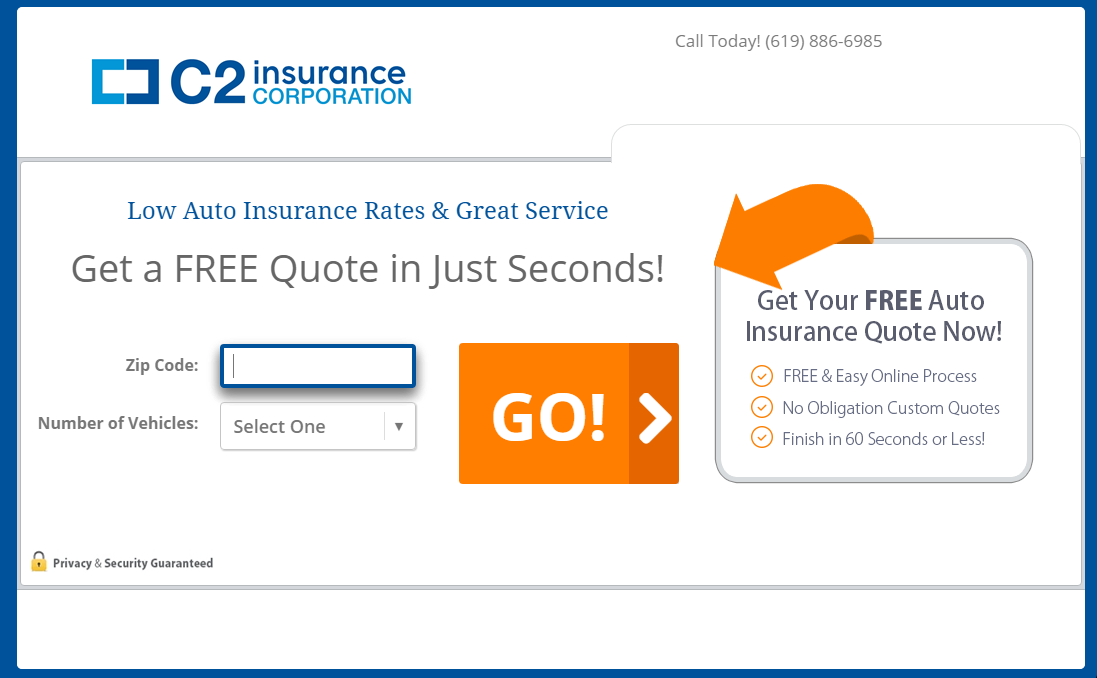
Is there any doubt where the call to action is? Of course not.
Not to mention the big orange button that says “Go!”
Hard to miss it, or misinterpret it.
Don’t make your visitors type “Control + F” to find the call to action on your landing page. In fact, don’t make them work at all. Make the call to action as obvious as it can be.
3. Putting the Important Stuff “Above the Fold”
In newspapers, the headlines that get the most attention are “above the fold,” or the headlines on the top of the page.
It works the same way online.
Scrolling down means you’re going “below the fold,” in newspaper terms. And the longer you make someone wait to find what it is you’re about, the more you risk them clicking “back” in their browser.
But let’s get specific.
What exactly should you put above the fold on a landing page?
- Your CTA. You already understand how important this is.
- Your selling points. What will you do for them? Are you offering them a quote to find out how much they can save, or an eBook, or guide in exchange for a newsletter? What do they get out of it? Make it obvious, and put it above the fold.
- Clear navigation. If you want your potential insurance leads to move around your website, put all relevant links on top. Again: the goal is to make the user do as little work as possible.
4. Proper Use of Colors
You’re in the business of selling insurance. So maybe you’re not used to the idea of using colors to make particular areas on your website or landing page pop.
But insurance shoppers don’t become insurance leads online by accident.
Check out the third point on InboundNow.com and see how one online store succeeds with a call to action button by making it the first red element on their site.
Or look at our own example above and see the obvious orange button that contrasts with the white background.
Without a proper landing page template, your use of colors might be random. The best way to avoid this is to either secure a service that provides quality landing page templates—or to try and do all of the work yourself.
The downside of doing it yourself? You might not be aware of important elements like this.
5. Explaining the Benefit of Your Insurance Offerings
As marketing guru Neil Patel notes, you have about eight seconds to grab your potential client’s attention.
If you don’t explain the benefit of your services immediately, you may not get another chance.
Take a moment and think about one sentence that explains exactly what it is that your service does better than anyone else.
Does your insurance offer greater security without the same cost?
Do you do your best to completely cover your clients’ needs?
Why should someone come to you for their insurance needs?
Most importantly, what’s in it for them?
Once you can answer this in one sentence, you know exactly how to state your main sales point on your landing page.
6. Credibility
The question is simple: how do you demonstrate your credibility in the world of insurance… if you only have 8 seconds or less?
Here are a few elements you can use:
- A photograph. A good “hero shot” image can make your service seem more personal. You can also use an image that helps draw attention to your CTA.
- Listing relevant credentials—or simply showing them above the fold visually—will have an instant impact. Think “As Seen On…” and some logos, like: BBB, Yelp, Trust Pilot, and other trusted websites and publications your users are likely to be familiar with.
- Nothing makes a service more credible than statistics and verifiable numbers that make your point. For example: “150+ 5-Star Reviews on Yelp” can build credibility.
7. The Ability to A/B Test
You should be able to test multiple landing pages to see which elements work the best for your service in particular.
In fact, when one company tried out something as simple a red button, it found it boosted its conversion rate by over 20%.
If making one small change can mean 20% more business for you, isn’t it worth testing?
A landing page that doesn’t make it easy to test multiple pages won’t allow you to optimize for maximum leads, either.
8. Intrigue
There should be at least one element of intrigue on your landing page.
What do I mean by “intrigue”? Simple. Your page should suggest that something interesting lay just around the corner for your insurance prospects. All they have to do… is click through to the end.
That might be something as simple as taking a quiz to find out about their insurance needs. Or it might be an enticing insurance savings calculator.
Whatever it is, a quality landing page will always create a sense of intrigue. Something interesting should happen when they click forward.
9. An Engaging Headline
Ever hear of the word “clickbait”?
Classic “clickbait” articles make a habit out of drumming up drama and intrigue with just their headline. They might say “Here are 6 insane ways to lose weight! Number two will shock you!”
This is a well-known tactic by now. But the principle remains:
Your headline needs to be compelling.
Don’t go full “click-bait.” But do take the time to write a proper headline that makes people want to read more.
10. Professional Design
Finally, you need an insurance landing page template that will make all of the above easy for you.
The end result: a professional, attractive landing page that says all of the right things about your insurance business and consistently converts exclusive insurance leads that turn into sales.
Check out the leadPops free trial to see how easily you can incorporate a quality landing page that fits in with your insurance business, even if you already have a web presence.
These landing pages will make it easy to incorporate the tips you read here. But they’ll do more than that.
They’ll offer you a baseline for generating new leads and creating new conversion funnels that will turn ordinary visitors into real, qualified, exclusive insurance leads for your business.

Comments open